Modelling for fun and profit
Typical public transport times
13 March 2015
As mentioned in the previous post I wanted to spend some time exploring the different trade offs involved with chosing a route by public transport (in London). In that post I highlighted the differences in expected time of arrival, travel time and uncertainty around those times for the train, underground and bus. I have now performed some simulations combining the modes of transports to explore how these differences influence your total travel time.

Looking at the figure the most interesting part is the difference in uncertainty. Clearly taking the tube is the most reliable way to get there in a certain time. Bus bus can be faster, but can also be much slower. As a result when choosing a route it is not only important to consider the average time it will take, but also the associated risk of being delayed.
Public transport planning and uncertainty
24 February 2015
There are a plethora of public transport route planning apps available for every platform. They often do a good job of providing you with the fastest route, and/or with the route with the least stops. There is one feature that I have always missed though and that is an indication of the risk of taking a route. For example if I miss a connection what will my delay be like? Will I be stuck somewhere for at least half an hour? I plan on posting a series of blog posts exploring this question in more detail. Hopefully starting of with some simulation, theory and then applying it to some actual data on public transport.
Background
I live in London and these posts will all be based on the situation in London. London has its own set of public transport and its own particulars. London has three main types of public transport:
- Trains
Reasonable regular time intervals. If you miss one you often have to wait for half an hour. Quite often delayed, but mostly a couple of minutes
- Underground
Every 4-8 of minutes, missing one should only delay you for a bit.
- Bus
Every 10-12 minutes. Officially on a schedule, but in London they don’t really follow the schedule. Missing one won’t cost you that much time, but the speed with which you get somewhere is very traffic dependent and so can’t really be counted upon to get you somewhere within a specified amount of time.
As one can see these forms of transport have quite different types of uncertainty associated with them. For example bus and then train is quite risky, because the bus might be unexpectedly delayed due to heavy traffic and then you might miss your train, causing you to have to wait for a long time. In the next blog posts I will try to explore these different situations and hopefully devise a way to take this risk into account when planning your journey.
Quite Interesting facts about QI scores
19 January 2015
The game show QI has a very interesting (and well documented) scoring system, but I’ve always felt QI could easily be “gamed”. For those of you who don’t know QI, it is a popular game show with Stephen Fry and Alan Davies. The whole show revolves around quite interesting facts and doesn’t take itself seriously (it does take the facts seriously though). Because players lose points when they say the wrong thing I have always had the sneaking suspicion that the game could easily be “gamed” by not saying anything, so let’s take a closer look at the scores.
Relation between scoring and talking
First, let’s explore whether saying more really results in lower scores. For this I needed the amount people were talking (represented by total number of characters in their sentences) and their scores. Luckily I found this website with transcripts and another website with all QI scores from all the episodes. I am afraid the transcripts only cover the first 8 series though, so I don’t have all the data. If we plot these and perform a linear regression (with R) we get the following picture:
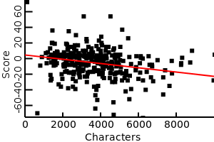
Although the relationship is fairly weak, it is (statistically) highly significant, showing that saying less and having a higher score are correlated.
Alan Davies (permanent panel member)
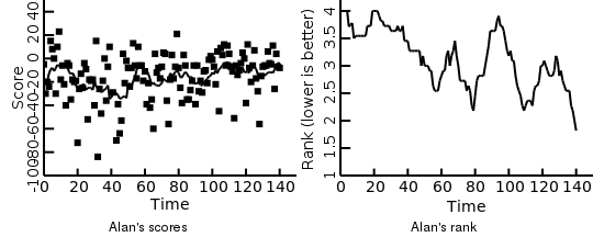
Finally, lets take a look at Alan’s performance over time. Since Alan is a permanent member we have his scoring data over time. On the left hand side we have his actually scores, with a running average (black line) and the right hand side the running average of the actual position he ended up in (lower is better). From the scores we can see that he started out quite good, then the scores got lower and slowly started rising again from show 40 onward. If we look at his rank every game there seems to be clear improvement over time. The apparent discrepancy of higher scores in the beginning but worse rankings is presumably because all other players also scored higher in the beginning.
This leads us to a frightening conclusion: if Alan keeps going like this he might end up winning every week :)
Hope you found this short overview quite interesting! If people have suggestion on other possible interesting facts in the data feel free let me know :).
Piping to a plot
05 December 2014
In a previous post I talked about an interesting new project I was working on that allowed one to pipe output from another program into a plotting program. The plotting program will interpret the incoming data and plot it to a png file. This allows one to set up a permanent named pipe and listens to that as follows:
mkfifo /path/to/pipe
plotcli -f < /path/to/pipe
I find this very interesting, because in theory it would mean we can just throw any data at this pipe and have it plot it. Of course there are a number of practical problems with this, that make it not immediately practical. Mainly due to the fact that plots often need a lot of context. I.e. what kind of data is this. How should it be interpreted? Should this data start on a new plot or be part of the previous plot etcetera. Currently with plotcli it is possible to provide this context using plotcli specific messages (i.e. #plotcli -d x,y). This is far from ideal though, because it largely defeats the object of making it very easy to plot any kind of data.
I wonder whether there are easier ways of doing this. It is probably possible to make educated guesses about what is meant most of the time. Still it is notoriously difficult to make a system that is both good at interpreting your meaning and easy to extend/improve. I’m open to suggestions :)
Multiple viewpoint dimensions
02 December 2014
Often political viewpoints are talked about in right-left wing context. In reality voters and parties can rarely be aligned in such a simple (2 dimensional) manner and political viewpoints can be aligned according to many different political axes (multi-axis political model. The website politcalcompass.org argues for at least two axes: economics and social. In this post we explore the effect of these changes.
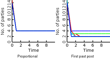
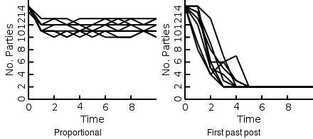
Above we show the voting history for a political model that assumes two axes. As shown the first past the post voting system results in 2-4 viable political parties. In contrast the proportional representation voting system results in 4 viable parties.
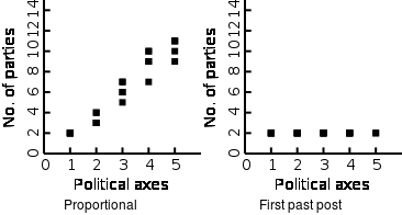
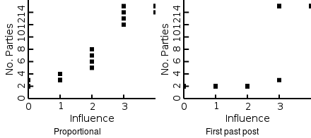
We can also see that the more political axes we assume there are the more sustainable parties proportional voting supports. In contrast, first past the post supports 2 parties almost regardless of the number of axes. You might also notice that the proportional voting on average results in two parties for each political axes.
Further additions to the model
I still want to add two things before I consider the model complete. First, parties that can change their viewpoint over time in response to the will of the voters. Second, the possibility for new political parties to appear in the model. I think both of those are very important features of a realistic model. After that I can spend one or more posts on looking at the results in more detail.
Plotting as easy as logging
24 October 2014
I’ve been frustrated with plotting for a number of years now. I mainly use plotting during simulations and it always feels to me like it should be as easy as logging some numbers to the command line. This frustration first let me to develop RealTimePlot, which is a C++ library that makes it straightforward to plot data with only a couple of lines if code. Still this left me slightly frustrated. Mostly because it was still easier to log some values to the console than to plot them because the console is always there. This was not helped by the fact that I undertook a major refactoring of the code and never finished that.
Recently I’ve gotten very interested in the D programming language so naturally I thought about writing another plotting library. This has resulted in plotcli. Plotcli is the result of many years of frustration and I hope to have finally cracked it by adhering to the unix philosophy. Instead of a library, plotcli is a standalone command line program that you feed data into. It will then try to plot this data in a sensible way. You can also provide it with information on the structure of your data either via command line switches or commands in the data file. See the wiki for some examples.
Some pros of using a standalone program vs library:
- On multi core machines you automatically gain parallelism
- Data is still around, making it easy to (re)plot it in different ways without rerunning the simulation
- No need to create bindings for different languages
Plotcli is still in quite early stages of development, but it is shaping up well and bug reports/fixes and feature requests would be highly appreciated.
Rational voting
27 September 2014
In the previous post I gave a quick overview of the long term difference of proportional representation vs first past the post voting systems and I showed that first past the post voting systems result in less viable political parties in the long run. This is the because in first-past-the-post voting only the larger parties have any chance of getting any power. The way I incorporated that in the previous post was a bit of a hack, where I just assumed that this was the case, without any reasoning. Here I will look at why this is indeed the case for any rational voter.
What does a rational voter want?
Naively one would think that what a voter wants is to vote for the party that most agrees with them, but ultimately a voter is interested in the power balance over all parties. Therefore, a rational voter should vote for the party that brings the balance of power most in line with his/hers viewpoint. This is also why people will vote for parties that wield more power, because those parties’ influence on the balance of power is greater. The easiest way to define the balance of power is the average viewpoint of all parties weighted with their power.
If we rerun the simulation using this measurement, we again get similar results in that proportional voting supports more parties than first past the post voting. One important factor though is how much people feel their vote is worth. If their vote is not worth much then also with proportional voting you only end up with two parties. Interestingly enough this is because people will only vote the fringe parties. This is because if the political power lies slightly to your right then the best way to influence it is to vote far left, because that will switch average power further to the left than voting for a party closer to you.
I have the feeling that this result is an artifact of only using one political axis. With more axes it become more difficult/impossible for this tug of war to happen, so we will have a closer look at this in the next post.
Proportional representation vs First past post voting
22 September 2014
In this post I will explore the different voting systems via simulation. For this we need voters and parties and then we simulate the number of votes each party from election to election. Naively we would expect voters to vote for the party whose viewpoint is the closest to the viewpoint of the voter. For simplicity we will assume here that a viewpoint is basically a simple variable defining their position on the political spectrum (far left to far right). Later we will look more into multidimensional viewpoints.
Voting
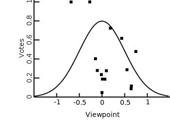
Here I’ve shown the outcome of one round of voting, where everyone votes for the party whose viewpoint is closest to theirs. Interestingly, one of the biggest parties is on the fringe here, because all the voters that are further to the left vote for that party. This means that even though most voters are central, “fringe” parties can get a relatively large presence because they cater to a wider spectrum of the political landscape.
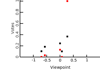
Taking power into account
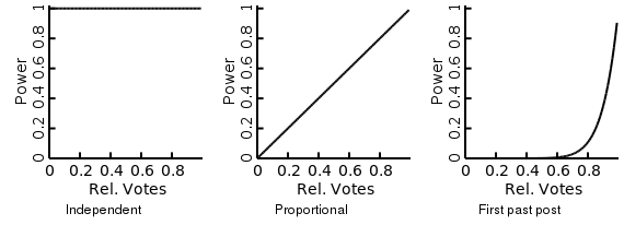
The previous example assumed that people will actually just vote on the party whose viewpoint is most closely aligned with their own viewpoint. Of course people will also take into account whether the party they vote for has a lot of power/influence. Here is were the difference between the voting systems come in. Illustrated above are some possible scenarios. 1) People’s decision is completely independent of the amount of votes 2) The power of a given party is proportional to the number of votes they received 3) Parties with high number of votes have a disproportionally large amount of power. In a pure first past the post system only the party with the most votes has any power. Here I chose a less extreme form of first past the post. This represents the fact that even if only the largest party has any power, when you vote you will not know which party will end up the larger party. Only that the currently larger parties are more likely to become the largest party after voting.
Number of parties
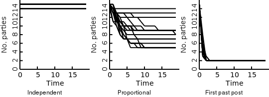
If we now simulate the number of parties over a couple of elections we will see that indeed the first past the post system ends up with the least (two) amount of parties. Proportional representation ends up with a higher number of parties. The exact amount of parties is dependent on the mix of parties (and their viewpoints) present at the start.
Possible next posts
In this post I had a quick look at different democratic voting systems and their results for the number of parties present over time. I hope to take a more in depth look over different possible aspects in future posts. Some things I want to look at are:
- How should rational people vote? Here I just assumed people would weigh their viewpoint by the amount of influence a party will have. It should be possible though to be more exact in how people would weigh these different factors.
- Evolving parties. Parties change their viewpoint over time in response to voters. This should also influence voting behaviour.
- Multidimensional political axes. For simplicity I assumed one political axis here (i.e. left to right wing). In reality the world is not that simple though.
Why did I start this blog?
19 September 2014
Every so often a discussion erupts on Slashdot discussing the merits of democracy. Part of this discussion always focusses on the two party system and its short comings. As someone from the Netherlands where we have at least 5 viable parties this part of the discussion always fascinated me. Especially now I live in the UK, where there are basically three parties. The main theory for the cause of this difference is a first past the post voting system versus proportional representation.
With my background in modelling biological behaviour my natural reaction to hearing theories is to write down a model that captures those theories (weird!). Which started me thinking that it would be interesting to do some modelling and explore the different voting systems in some more depths purely to satisfy my own curiosity, but I could never find the motivation to actually do this. Hopefully having this blog and the imaginary future readers will motivate me to actually move forward.